Examples
Data Table, Data Loading
File and Data Table
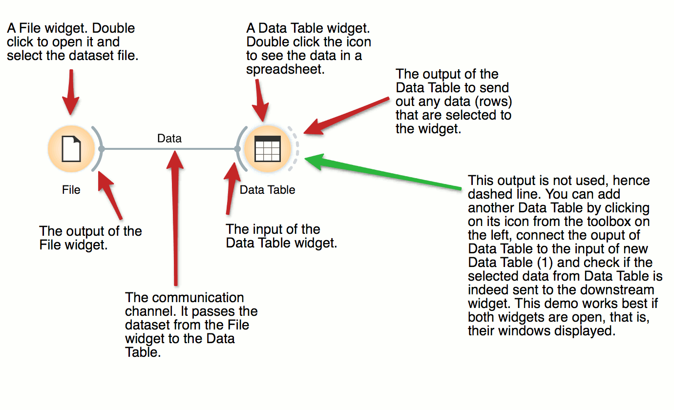
DownloadThe basic data mining units in Orange are called widgets. In this workflow, the File widget reads the data. File widget communicates this data to Data Table widget that shows the data in a spreadsheet. The output of File is connected to the input of Data Table.
Scatter Plot, Visualization
Interactive Visualizations
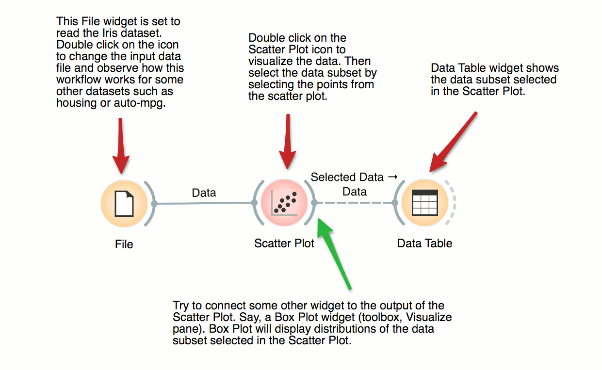
DownloadMost visualizations in Orange are interactive. Scatter Plot for example. Double click its icon to open it and click-and-drag to select a few data points from the plot. Selected data will automatically propagate to Data Table. Double click it to check which data was selected. Change selection and observe the change in the Data Table. This works best if both widgets are open.
Scatter Plot, Visualization
Visalization of Data Subsets
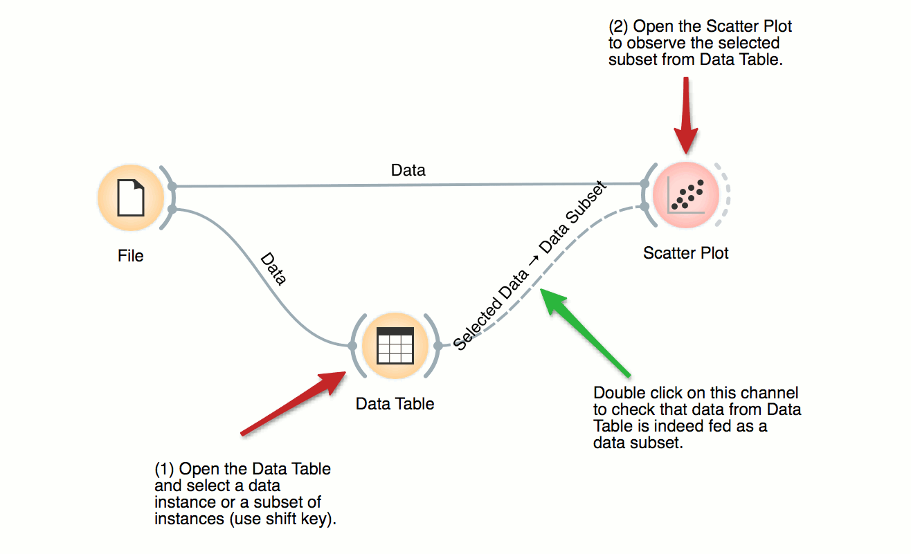
DownloadSome visualization widget, like Scatter Plot and several data projection widgets, can expose the data instances in the data subset. In this workflow, Scatter Plot visualizes the data from the input data file, but also marks the data points that have been selected in the Data Table (selected rows).
Data, Pivot Table
Pivot Table
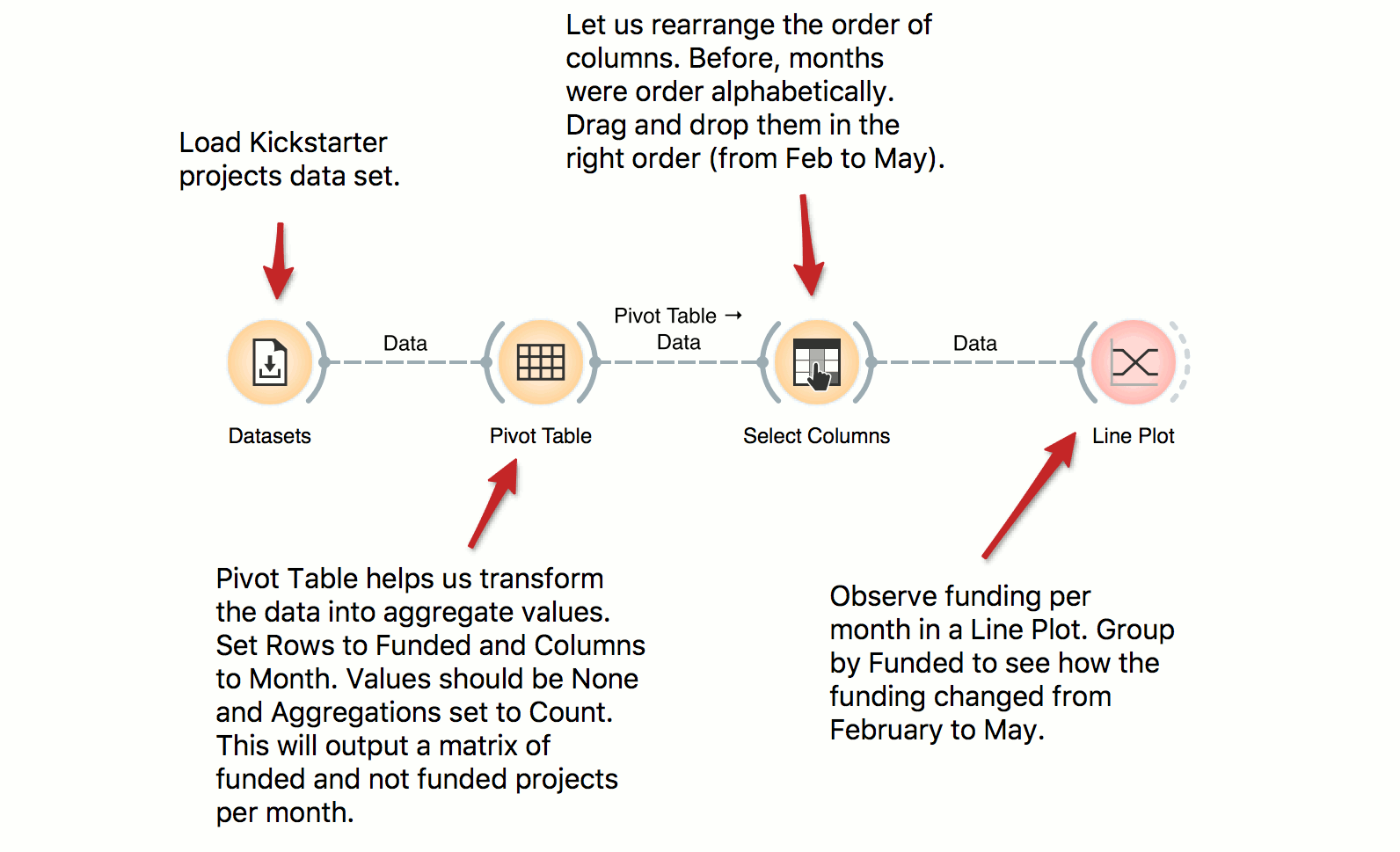
DownloadPivot Table can help us aggregate and transform the data. This workflow takes Kickstarter projects and aggregates them by month. We can inspect the frequency of the published projects per month and observe the difference between funded and non-funded projects. Try constructing several tables with pivot and experiment with different aggregation methods.
Classification Tree, Classification
Classification Tree
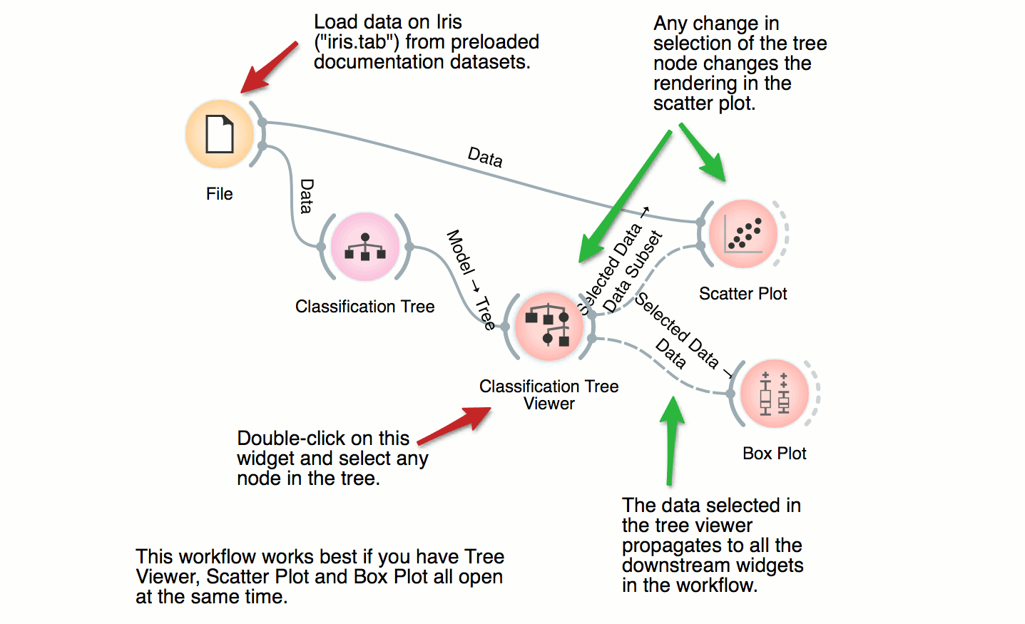
DownloadThis workflow combines the interface and visualization of classification trees with scatter plot. When both the tree viewer and the scatter plot are open, selection of any node of the tree sends the related data instances to scatter plot. In the workflow, the selected data is treated as a subset of the entire dataset and is highlighted in the scatter plot. With simple combination of widgets we have constructed an interactive classification tree browser.
